What are the Qualities of a Good Logo?

DATE: 11th July 2022
CATEGORY: creative
TAGS: brand design, brand strategy, graphic design, print design, ux design
AUTHOR: Peter Garrett
Creating a brand logo can be a challenge for even the most experienced graphic designers. Ensuring that a logo is on-brand, timeless and gives off the correct impression is essential without letting personal preference hinder your judgement.
Seeing a logo as an object; removing feelings and opinions, so as to not cloud the end result, will allow you to decipher if the logo possesses good qualities. Does the logo communicate the brand's ideals, values and services? Is it timeless and memorable?
In this article, we will discuss the main qualities of what makes a good logo and how to ensure it is a success from the initial design process.
What makes a good logo?
Having your logo carefully designed is an important step in ensuring your organisation will be taken seriously in your industry.
There are numerous key aspects that are important when designing a company logo. We have picked out our top 5 to ensure your logo is identifiable and customers will instantly connect with your brand.
-
Distinctive
-
Relevant and on-brand
-
Timeless
-
Adaptive
-
Simple
Continue on to learn more about the qualities of a good logo.
1. Distinctive
It’s essential that a logo is distinctive and memorable to customers. They should be able to understand the relationship between the visual identity/brand and the logo. This consistency of message will increase the likelihood that they may engage with you. Memorable and distinctive logos combine many elements, however, the most important is the balance of visual and textual aspects. Each company should have a unique visual identity and a bespoke logo is one small part of their overall brand.
2. Relevant and on-brand
Relevance refers to how a company's logo design connects with the brand's audience and values. Prior to designing a logo, it’s essential that research is conducted to understand who your target audience is; such as their age, gender and interests. Following this, you will be able to piece together design elements which best suit your audience; these can include principles such as colour, typography, space, shape and form.
3. Timeless
When you’ve spent so long researching and developing a logo that matches your company and brand perfectly, why would you want to redo it all again a few years later? Although it’s acceptable to retouch small aspects of a logo over time, interfering with it too much will alter how the consumer connects with the organisation. In order to develop a timeless logo, you should continue to focus on your target audience and try to avoid industry trends, as these can date very quickly.
4. Adaptive
A successful logo can be used in a variety of ways. Ensuring that your logo is responsive to a range of mediums including digital and print, will make your brand more visible and attractive to audiences. Having a website with a pixelated logo doesn’t exactly portray professionalism. Creating a clear and responsive logo will align you with other market leaders and will demonstrate to your consumers that you are a trustworthy, credible business that is capable of communicating clearly.
5. Simplicity
Keeping your logo simple will make it more versatile and instantly more memorable to your audience. A logo needs to encapsulate your company's brand message, ideals and values through legible type, minimal imagery and shape. Following on from the previous point, if a logo is too complicated and cluttered, it will make it very difficult to resize or be responsive to the wide range of mediums that may be necessary to your business.
Serenity Digital’s approach to designing a new logo (and brand)
To begin the process of designing your new company logo, we start with a workshop to capture all the information we need. During this time we’ll discuss your audience, your products, services and offer, what makes you unique, document your personality, tone of voice, mission and values, establish your current future position within the marketplace and consider your competitors.
Following on from the workshop we will begin creating initial draft concepts both digitally and hand-drawn. These will be in black and white first as a good logo should work without colour (remember, there are occasions where colour will not be available to you).
The best concepts will be digitally refined into vector format (a format which does not lose quality or precision no matter its size). With appropriate consultation to discuss the rationale of each suggestion and after gathering client feedback there may be further refinement to the chosen concept and variations worked up for different mediums.
Any logo redesign should always be considered at the same time as a review of the organisation’s brand to ensure that everything remains consistent. Following this work, assets are provided in digital and print formats, with each medium-specific variation supplied.
Here are a few examples of our logo design work:
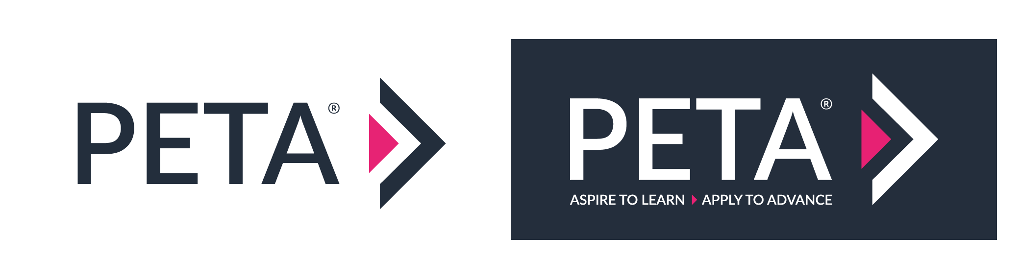
PETA Training and Consultancy
PETA provide corporate training courses, consultancy, apprenticeship training and placement across the UK.
Our logo graphic purposefully utilises a sans-serif typeface to maximise legibility and clarity. The arrow mark following the brand name stands for PETA’s vision to embrace excellence, moving forward and improving for and on behalf of staff, clients, delegates, learners and our society.
The PETA brand adopts a clear strapline which describes the journey which delegates and students will be on when taking part in PETA training courses. The strapline comma is replaced by the logo arrow mark to demonstration the path of advancement which each learner is on.
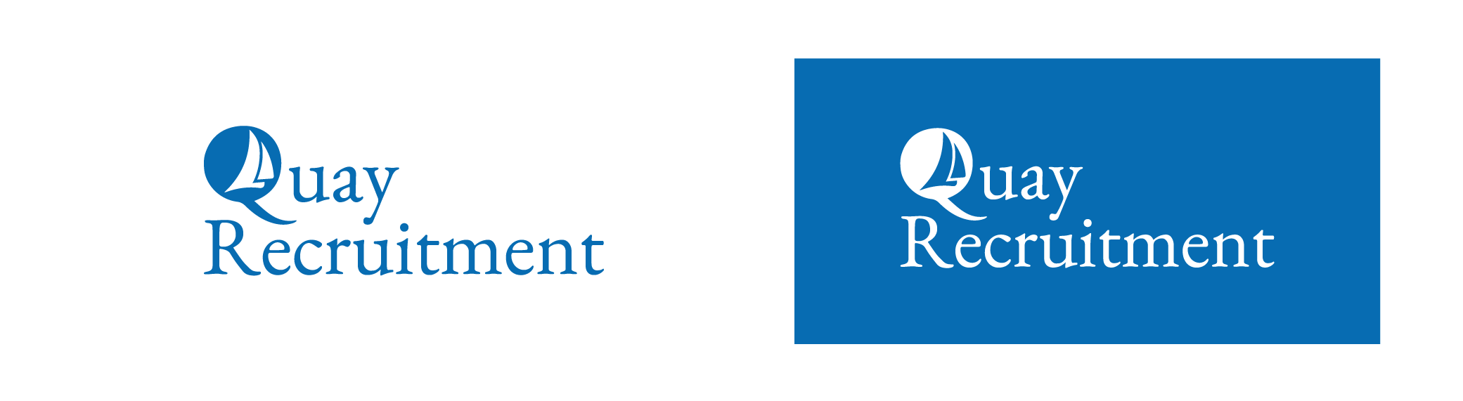
Quay Recruitment
Quay Recruitment Group provide consultancy designed to help their partners transition from outdated to more cutting edge recruitment practices, reducing their overall cost to hire.
The Quay Recruitment Group logo stays true to our roots and proximity to the sea. The sails within the Q represent the growth of the company, driving forward improvement, innovation and growth in everything we do.
A serif typeface has purposefully been chosen to remind our audience of the more aspirational and elegant side of our business. Whilst we always seek to utilise the latest tools and techniques available to better our organisation and help our clients, this approach should never detract us away from good old-fashioned face-to-face consultancy.
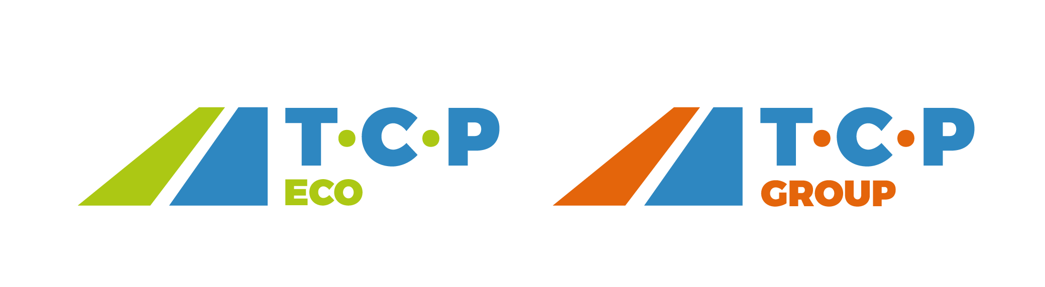
Taylor Construction Plant (Group, Eco, Plant)
TCP Ltd continue to supply Europe with exceptional and innovative lighting, construction and compaction equipment from their four depots across the UK. Their brand has been purposefully positioned to distinguish between group activity, eco friendly products and existing plant machinery.
All logos have been designed to ensure legibility at a distance. The group colours are contrasting colours designed to stand out when seen next to each other and maintain the original colours of the older Taylor Construction Plant logo, providing a nod to the heritage of the business. The typography has also been chosen to ensure legibility at a distance as often the logo will be seen on machinery.
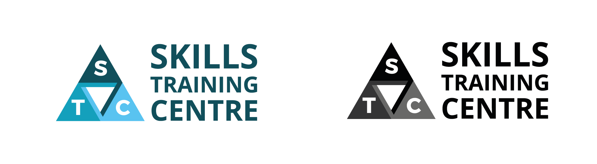
Skills Training Centre
STC are specialists in providing skills and safety training for corporate and public sector organisations across the UK.
The Skills Training Centre brings together a number of themes which represent the brand. The three arrows/triangles are all directional both to the location and giving the impression of focus and attention. The inner shape and overlays are designed to convey a theme of continuous movement, which in STC’s case represents continuous growth and improvement.
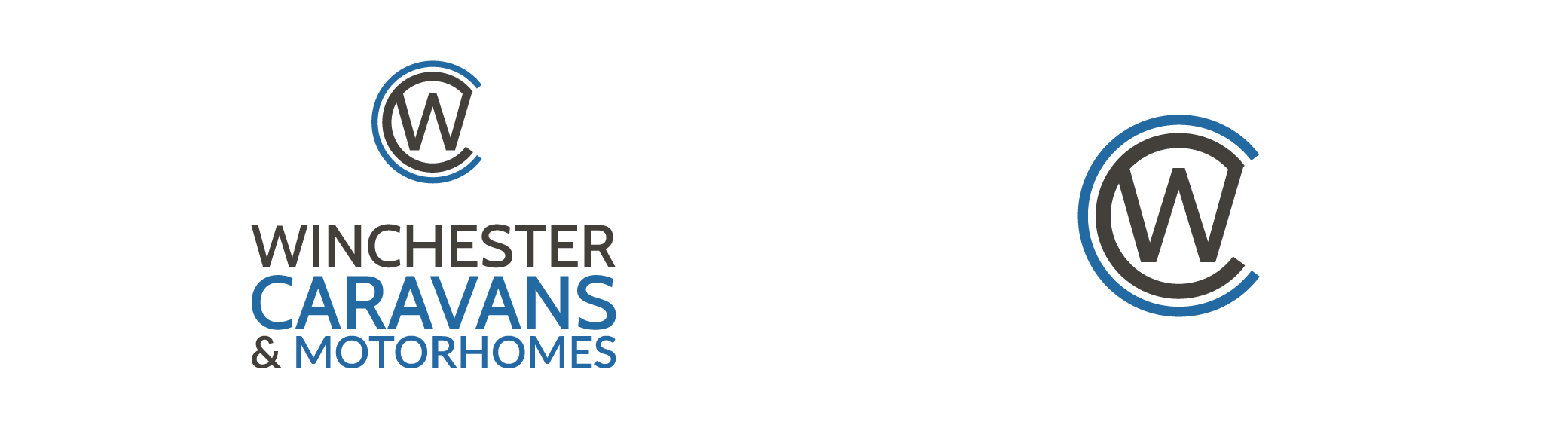
Winchester Caravans
Winchester Caravans provide new and pre-owned caravans, new and pre-owned motorhomes, awnings and accessories across the UK from their shop and forecourts on the South Coast.
Our logo symbol encompasses the main two letters from our brand name bringing about a badge often associated with automotive brands. The logo is designed to make purchases feel like they have become a member of our club. Both the logo symbol and strapline have changed over time to accommodate our significant growth, success and expansion into other products and services.
Beacon Insolvency
Beacon Insolvency are one of the South Coast's leading licensed insolvency practitioners offering light through the difficult circumstances that arise around financial hardship.
It was always clear to us that our location on the South Coast and the symbolic reference of guidance from a lighthouse worked perfectly for our logo symbol. An uppercase clear san-serif typeface was used to ensure the quality and simplicity of our consultation and guidance was also conveyed. The symbol and variations of the logo can be used across multiple mediums.
![]()
If you’re interested in learning more about our logo design service, and how our team of talented individuals can assist your business, please get in touch.
« All blogs